CIBC Mobile Banking is a mobile app developed by the Canadian Imperial Bank of Commerce on the Apple Store. Users can check their accounts, finish personal banking tasks and use some services online.
This app was selected by myself as an academic project's subject for my User Experience Design course during the study of Interactive Media Design at Algonquin College.
Type
Academic | Individual
Timeframe
4 Weeks
(July 15, 2019 to Aug 15, 2019)
Deliverable
Redesigned Mobile App
Tools
Adobe XD | Sticky Notes | Pencil | Paper |
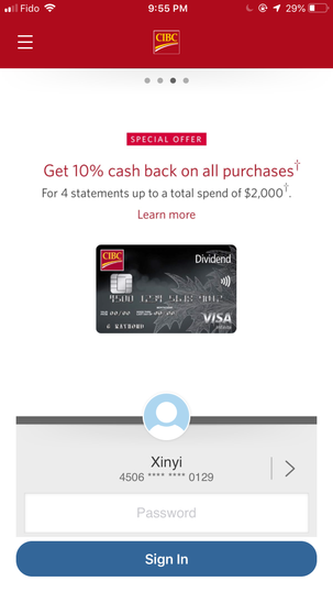
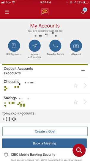
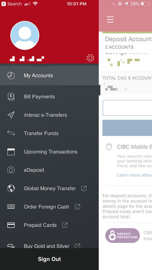
Original Interface
Problem Statement
• Why Did I selected CIBC?
There are some apparent problems with the color combination and font size. They used their primary color - CIBC claret and blue and graym which was a simple color scheme. But it lacked emotional design. The old interface looks simple, yet it didn't make fair use of the branding guide. The interface can be more intuitive and aesthetic by reorganizing functions to reduce the cognitive workload and reuse the color palettes from its branding guide.
• Tasks & Deliverables
This project is for testing student's ability to improve mobile apps design in the course. I worked by myself throughout the whole UXD process, from research to prototyping. But the students helped others as interviewees for user-testing; The qualitative and quantitative research methods—Focus Group and A/B Testing-were used to test the usability of wireframes. Much valuable feedback contributed to the completion of this project.
The final deliverables included landing page, log-in page, main dashboard and hamburger menu page in a cleaner, attractive, intuitive interface with a better color scheme.
Project Timeline
-
Research the company's business goal and the product's user goal
-
Fill in the details of the creative brief
-
Ideation: Sticky notes, site map, group information
-
Usage scene
-
User flow
-
Two versions of lo-fi wireframes
-
Focus group
-
Paper lo-fi prototype
-
Digital lo-fi prototype
Company Research
The first thing was writing the creative brief that acts as the guideline of the project. I spent lots of time researching the app, CIBC's brand background, and its competitors to ensure that the redesign could closely reflect the brand and had a good user experience.
This research's main resources are CIBC's official website, CIBC mobile app, my own knowledge, and Apple Store content. I found the brand's core value, products, branding guide and other materials on CIBC's website. After organizing my own user experience of the app and the thorough inspection of its interface, the user goal and paint points became clear. Because TD Bank, BMO (Bank of Montreal) and Scotia Bank are known as the leading banks in Canada and their apps had the highest ratings among other Canadian Banks, they are definitely the primary competitors I should focus on. I looked at the interfaces and descriptions on the Apple Store of these competitors; I also gained much knowledge of this industry which could have helped me in design.
Read the Creative Brief.
User Research
I firstly defined the general demographic, psychographic and geographic information of the target audience, according to my experience, knowledge and research, as a groundwork to divide these people into three specific groups later.
The target audience research couldn't accommodate different user groups' needs, based upon which three personas were created to represent three main user groups for a deeper analysis. The main sources of information on each persona are my observation of peers, work-class people, the elder and my own experience as a z generation (Z generation: Researchers and popular media use the mid-to-late 1990s as the starting birth years and the early 2010s as the ending birth years.).Then I used mind maps to elaborate on their traits to conclude user behaviors that might determine design decisions.
Mood Board Design
We could see the old color scheme from the app interface includes the CIBC Accent Red, dark grey, black and the interactive colors—blue and dark green. In emotional design, the colors, fonts, and imagery should always reflect the company's image to its target audience. Because the brand colors were established and the neutral colors like black and grey were not that influential, I focused on adjusting the interactive colors.
From the research, you can see CIBC's tone & manner is reliable and trustworthy and their business strategy is to put the clients in the center and build enduring relationships with them. Although blue and dark green can give a stable, reliable, professional vibe, this combination couldn't provide a positive and caring feeling. According to "The Wheel of Emotion,"(Plutchik's Psycho-evolutionary Theory of Emotion) developed by Robert Plutchik, this combination brings out the vibe of despair.
On the other hand, there were still CIBC yellow and claret left on the color palette. From the whole brand image, there was no blue and dark green even on their website or brochure, so I decided to use CIBC yellow as the background color since it is lighter while accent red and CIBC claret acted as the interactive color. Yellow brings a joyful vibe, and red gives an energetic vibe. This combination provides a feeling of pride and positivity, and the brightness makes people more alert. Yellow itself is also associated with money, value. The final color design fully utilized its branding.
Ideation
My plan was to redesign the landing page, log-in page, account page including its sidebar menu. I used sticky notes to categorize the contents of each page. After I had organized them, I mapped out a clear content structure in the site map and listed the visual and technical information.
Based on the site map, I described a possible user story, which determined the user flow. Then I drew the pages' thumbnails in the sequence of user flow, during which I used some inspiration from TB Bank, BMO Bank and Scotia Bank's apps, especially for the advertisement and Log-in parts.
A/B Testing for the Two Wireframes
Once a general thumbnail was done, then I started to sketch two wireframe versions. Next, I conducted an A/B testing with a focus group to collect feedback on both versions for the final version creation.
Focus Group Questionnaire
Summary of Feedback
Low-Fidelity Prototypes
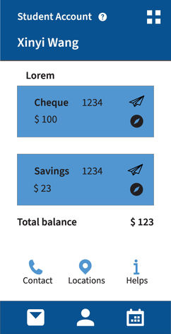
I sketched a paper low-fidelity prototype and based upon which, on Adobe XD, I created the digital low-fidelity prototype with sample colours, guidelines and UI elements.


Version 1

Design Highlights:
1. Ad or/and announcement are on the landing page to avoid the occasion that people ignore the ad.
2. Had Register and Forget-Password buttons displayed; users don't need to think or click more if they have log-in issues.
3. Utilize the top navigation bar with some essential functions displayed.
4. A profile image uploaded by the user (default is CIBC logo), account type, and the account policy button.
5. In the hamburger menu, some tabs were merged into a collapsible tab to avoid scrolling, making it cleaner, less crowded.
Version 2

Design Highlights:
-
The advertisement/announcement page scrolls down.
-
A slogan was added to the brand page to convey the key message.
-
An option to clear the memory of your card number was added, inspired by other competitor apps. Although CIBC also has such a function, it didn't display it directly.
-
Sometimes people open the app to find the closest location or the contact information of the branch. Having them on the log-in page is more convenient for users.
-
Remove the unnecessary profile picture.
-
To improve the fonts' visibility, I chose to list the hamburger menu items to a single page.
-
Unlike the first version, I prioritized the account information and put the main navigation at the end of the screen to focus on the user.
High-Fidelity Prototype
Product Presentation
View the presentation to learn about how I sold the redesign product to the audience.


Things that I learned
1. It would have been better if I took the feedback from A/B Testing to integrate two wireframes' advantages instead of choosing just one of them.
2. I could have created UI elements by myself rather than using an iOS mobile kit, especially because some icons there were confusing (paper plane and clock icons).

