

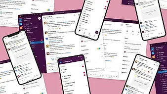
This project redesigned Kandy Live Support's UX to expand its market as a White-label Contact Centre product
Employer
Tasks
Competitor Research, Prototyping, Wireframing, Presentations, Visual Design, Information Architecture
Role
UX Designer
Tools
Sketch, InVision, Apple Notes, UXPRESSIA
Type
In-House, Internal Project
Timeframe
Feb 14, 2022–May 13, 2022 (3 months)
Problem Statement
The inconsistent visual design, cluttered information architecture, and broken user flow of the product had impeded its sales
User & Audience
Contact Centre Agents, Supervisors, and Managers are the personas of Live Support
There are three types of users for this Contact Centre—Agent, Supervisor and Manager. Supervisors and Managers can access the admin dashboard, while the agent can only access the support dashboard.
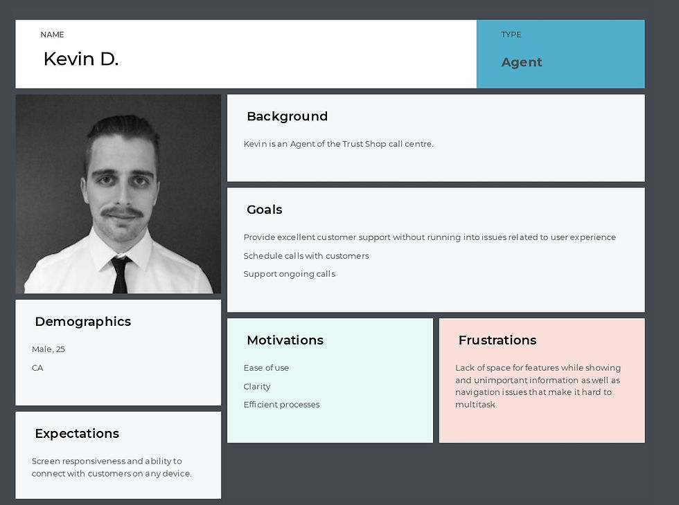


Personas from UXPRESSIA by the team
Roles & Responsibilities
As the primary designer, I collaborated with the senior designer and internal stakeholders in a remote agile design team
I researched, designed and presented deliverables with the assistance of the senior designer and collected feedback from the internal stakeholders, working remotely via Microsoft Teams meetings and InVision.

_svg.png)

Scope & Constraints
The scope includes 3 stages—research, brainstorming and design. Unfortunately, no user base existed for objective feedback in this project
Live Support was a low-priority project with no clear deadline. To keep it on track, I used Basecamp to manage daily tasks and track progress, and I set up a proposed UXD Process on InVision Freehand as a guide. The design planning had to be aware of its White-label characteristic from the start.

Process & Activities | Preparation
A UX process and task lists were created to encourage a Design Thinking approach, keeping records and controlling the timeline
A “Live Support Breakdown” InVision freehand was created as the guideline and the database for the latest inputs that helped to track the progress and follow a Human-centred Design methodology. It has three parts—Questions for each stakeholder meeting, Notes from research and the User Experience Design Process with the latest updates.

Questions for the stakeholders

Design Updates' archive
Research Notes
The creative brief of the UXD process stored all known background information, and the questions pushed me to dig into the design requirements at the kick-off stage.

I reorganized the information on the dashboards by examining their structures, labeling, navigation systems and search systems
First, I examined both dashboard types to collect web items. During the examination, I focused on the following
-
Information architecture: How the information is structured and organized
-
Labeling: How the information is represented
-
Navigation Systems: How the user browses and moves from point to point
-
Search Systems: Do we need any search space? How to position the search?
I documented these items in Apple Notes and used colour labels to categorize them.
Information Architecture for Managers Apple Notes Draft

1

3

2

4

5
Information Architecture for Agents Apple Notes Draft
Information were divided into these categories by colors. The priority of items inside a category were represented by red and green circles.
Dashboard
Settings
Chat Request
Chatbot Sessions
All Sessions
Contact Customers
Primary Import (item of its group)
Secondary Important (item of its group)


Agent Console Site Map draft from the categorization


Main view
Settings (secondary view)
I empathized with the users and gained a better knowledge of their needs and flows by scanning the personas and testing and recording my experience as an agent on the dashboard
According to the persona file from the former staff, I summarized these needs and wants.
Manager
Goals:
Minimize the learning curve for new recruits
Provide support to supervisors and agents
Daily calendar planning
UX Requirements:
Admin & gent portals should be combined into 1 single UI system
Needs:
Usability, clarity and efficiency
Frustrations:
Cluttered UIs, flows are broken, reporting function is bad
Supervisors
Goals:
Supervise, reporting systems
Needs:
Usability, clarity and efficiency
Frustrations:
Difficult multi-tasking (too much information to digest, the navigation was chaos, and the features were scattered)
Agents
Goals:
Schedule calls, support ongoing calls
Needs:
Usability, clarity and efficiency
Frustrations:
Difficult multi-tasking (too much information to digest, the navigation was chaos, and the features were scattered)
A critical performance indicator of a contact centre UX is EFFICIENCY. The more seconds the agent spends navigating, not on their chats, the less efficient and productive the it is. To find out how efficient this software was, I tested it as an agent. This testing improved my understanding of its user flow; notably, some defects in interaction design were discovered.

Restricted Interface
-
Buttons piled up in one column
-
Dual sidebars wasted much space
-
No enough space when salesforce, chat and video all open


Awkward Internal Chat
-
Same agent appeared in different departments
-
No back to agent list button when in a chat
-
Narrow typing space and strange white space for chat history

Branding
-
Bad color contrast
-
Limit to no customization
Space Issue in Video Chats
-
Video was located in the agent list
-
Have to expand the video for chat-specific actions and minimize it to go back to the chat
-
Less space for Salesforce was pulled down

Mental Recall needs improvment
-
Some actions were icon button without label and agents might forget what they mean
-
Action buttons were all over the interface—no consistent placement of actions

Restrictions of the 3-Panel Approach
-
Scrolling-down became a problem in many columns
-
There could be possibility for a 4th column
-
No loading indicator from the system
-
The design restricted the possibility of filters, tables and paginations
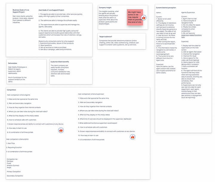
The competitor research provided insights into good practices and business strategies that could contribute to our design
The competitor research provided some good UI examples, insights and business strategies for our information architecture and features. The competitors I looked at were Five Nine, Amazon Connect, Genesys, Avaya and MIDA.
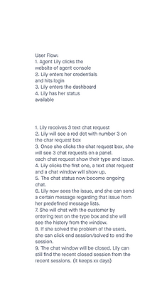
I built a new agent dashboard site map from the reorganized information architecture, and imagined a user flow
This site map for Agent Dashboard on InVision Freehand became the foundation for the first wireframe. Based upon that, I wrote a hypothetical user flow of an agent named Lily, showing how she may enter and use the dashboard.

UI inspiration from Dribble and software-at-hand helped to introduce good practices into the wireframes
I also went to Dribble to find inspiration with some keywords such as "contact centre," "contact software," and "call list" for wireframing inspiration. Microsoft Teams and Slack also gave me ideas on agent status, settings and features.


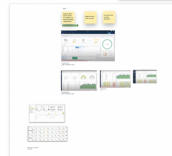
📝 Research notes
1. Implement a search bar on the top of the console for a global search (search for a recent chat, agent, customer information, etc.)
2. Simplify the status into green dot/yellow/red. (green: available to serve; yellow: serving other customers; red: offline)
3. Under the profile pic, list menus: a. change your status, b. Set your predefined messages. c. Settings. d. zoom in/out;
4. Each request should show: 1. request type: text, voice or video. 2. Issue: xxx.
3. Maybe don't use anonymous. If there are too many requests, will have too many anonymous which might mess up the chat responses for the agent, use phone number for now.
4. The current request sound is not very clear
5. The button for attachments, predefined messages on the input should have tooltips like Slack
6. To distinguish the differences between agent text and customers: use a background color for customer's text.
7. Set out of office schedule (maybe on the admin side) and auto reply message
8. Should have "read receipt". The customers know that the agent have read their messages.
Process & Activities | Wireframing
After the first assessment, item labeling and design requirements were enhanced, and the wireframes would merge


Findings from the Research on Genesys helped the site map brainstorming and agent dashboard wireframe integration
I selected Genesys as the study subject because of their user-friendly design and their features and functions. I did an interactive tour of their Contact Centre, learning each item, taking screenshots of flows and UIs.

Based on the last review and discoveries from Genesys, I created an enhanced Site Map. The following wireframe addressed UI details and reflected the Site Map. This second review achieved a more precise picture of the Agent dashboard.


We brainstormed the primary navigation and consolidated the menu items for the admin dashboard
The next step was to focus on the admin dashboard that was a management dashboard where you could configure settings, manage users and read data. The challenge was positioning numerous items smartly. Before, these items were laid out on Home; the navigation was bulky that required much cognitive workload for the user. Both agent and admin dashboards should have a consistent navigation design. And navigation was crucial in management dashboard design. I solved the challenge by categorizing items into basic groups. The items under a group work as the secondary tabs of the main menu.
I put all items on sticky notes and reviewed them with the stakeholders. Our discussion led to six main navigation groups—dashboard, reports, management, web builder, settings and inbound voice, as the primary navigation tabs. I presented several navigation looks. The vertical sidebar with a hide-and-show button served the best UX as it helped the user focus on content better.


Navigation Option 1

Navigation Option 2

Navigation Option 3
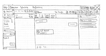
We adjusted some naming on the Site Map and modified the general requirements. I sketched three wireframe versions as the first agent console draft, based on the research, for an AB-Testing purpose to be reviewed by the stakeholders. It turned out that each had pros and cons, which was calling for integration.

Process & Activities | Prototyping
We discovered some defects in the features, style guide and usability of the first hi-fi prototype
The prototype was built on Sketch. The initial style guide followed our company's branding—blue and shades of grey.


🔎 Drawbacks
-
A global search had no valid use case at this stage.
-
The rounded borders didn't fit the personality of this product; A round border conveys softness, emotion and empathy visually, while sharp squares denote efficiency, business and rationality.
-
The necessity of the Announcement panel was under debate.
-
The user might have 10+ messages, so how will the design solve this case?
-
The internal chat occupied too much space as a secondary function.
-
The style guide needed to be more neutral and customizable for the while-label characteristic.
-
The transcript-share function didn't have a valid use case.
-
The message icons could potentially confuse agents, not intuitive enough.
The 2nd version prototype introduced a more neutral style guide with UI improvements


🚀 Improvements
-
Simplified style guide: a blue can was used on interactive items. Neutral greys, white and black were the background and font colours. Green indicated active and safe statuses, and red suggested warning and urgency.
-
Precise "connect with customers" function: Change the "+" icon to two icons representing texting and calling to connect with customers.
-
The agent could read performance and session activities on one page. Performance was moved to the right beside the sessions panel. The navigation was removed for Agent Dashboard.
-
Improved notification centre: I removed the message list from Home; instead, I used the Number icon beside the Internal Agent icon to indicate how many messages were unread. "Mark all as read" and "view all messages" were added for a better experience. The former helps you clean up notifications, and the latter lets you scroll inside to view all notifications.
-
Turned the icons "transcript share," "screen-share," and "co-browse" into text buttons for a clear representation. And the information panel was moved to the bottom.
💬 Feedback
-
Transcript share and consulting another agent will be removed from our functions.
-
The green looked dominant in this design. It appeared in active statuses, call icons and chat bubbles. As the green was only a subsidiary colour, its role should be more defined and limitedly used on the colour palette.
-
The internal chat modal occupied ⅔ of the screen as a secondary function.
-
The information panel's position made it difficult for the agent to move from the chat to information frequently.
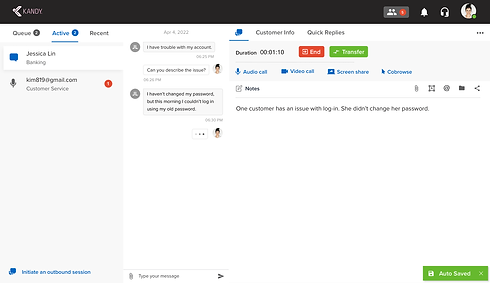
The 3rd prototype improved UX, introducing agent settings and internal chat modals


🚀 Major Changes
1. The layout of the prototype. Now the agents can hover between chat and information side by side.
2. The order of session types had been adjusted; the queue was prioritized in the menu, as in the default, the agent would start by accepting customers from the queue, so we should keep the queue as the primary tab here.
3. I put all controls (end session, transfer session and support buttons) on a control bar that made agents operate faster. Notes was now more prioritized than Customer Info with robust editing tools and auto-save in this design. I moved "initiate an outbound session" to the button of the session panel as more integrated apps, for instance, Salesforce, Facebook would be added to the information panel, we needed to extend the width of the information panel.
4. The emoji was removed, and the "attachment" icon was used for both files and images.
5. Notification was now moved to the navigation. The agent could view notifications in a small modal.
6. The chat had three parts—Search, Chats and Contacts. The agent can search a keyword to start a chat or check their history. The agent could chat with one or more staff. The agent could know whom they were talking to, how many unread messages were in a chat and the status of the other agent. On the Contacts, based on my research on contact list UIs, I introduced Starred Contacts. Agents could quickly access their mentors or supervisors for help. Like the old software, the agent chat with any agent. However, we knew a user's frustration was that they found an offline colleague from the list. To prevent that, I introduced the filter "available users" and "all users." Now the agent could find only active agents, or they could leave a message to someone offline.
✍️ Minor Changes
The colour palette looks more neutral now. I used blue to replace green for all interactive links and buttons. And only grey colour was for backgrounds. Agent settings modal was introduced. All unread messages would use a number icon pattern.
💬 Feedback
-
We would only have the profile of customers sometimes; remove the profile pictures for both sides
-
The Notes taking function does not require an editing toolset
-
The information panel needed better organization for apps. And Recent Session was less important than Queue and Active. It could be moved to the bottom for more space for the information panel
I methodically designed prototypes that showcased a complete user flow of the agent dashboard, practiced UX principles and borrowed ideas from other software
The next step was producing a complete agent dashboard design. I split the user flows into four parts to design individually.
1️⃣ Home
These prototypes present the empty dashboard. I added a few informational words to the empty queue and active sessions. In the research for Onboarding Experience, I found out many products like Slack would add tips in an empty area to stimulate user actions.


2️⃣ Internal Chat Design


Mute-all was added as an option for when the agent needs to focus on ongoing sessions to ignore all messages. The space below the chats also has guiding words for the agent.

The design of a "More" option icon for further actions was inspired by Wechat. The user can take some actions on the chat or the contact. To create a group chat, click the button, you will see the contact list, and you will be able to search or add people from there.


Navigation design from WeChat to Live Support
More Actions and Create Group Chat in WeChat and Live Support
3️⃣ Refined agent settings flow


-
The agent can check departments from the list
-
The content of the settings modal was illuminated by Microsoft Teams.
-
I learned the notification settings design on Microsoft Teams. In my experience as a fake agent, Live Support only had one sound effect, so that the agent wouldn't know the context of the sound. However, competitors have sounds for different types of notifications to help users recognize the context. That's why I created 3 sound effects. To differentiate the software-wide or detailed settings, "mute-all"and specific notifications are placed differently.
-
In well-developed software like Genesys, they categorized responses, and the agent might have the permission to add more. I incorporated that feature.
-


Agent Profile and Settings Inspiration from MS Teams
4️⃣ Support Modes
Information Panel
Previous Prototype Version
Current Prototype Version


Process & Activities | Prototyping
We discovered some defects in the features, style guide and usability of the first hi-fi prototype
The prototype was built on Sketch. The initial style guide followed our company's branding—blue and shades of grey.
🔎 Drawbacks
-
A global search had no valid use case at this stage.
-
The rounded borders didn't fit the personality of this product; A round border conveys softness, emotion and empathy visually, while sharp squares denote efficiency, business and rationality.
-
The necessity of the Announcement panel was under debate.
-
The user might have 10+ messages, so how will the design solve this case?
-
The internal chat occupied too much space as a secondary function.
-
The style guide needed to be more neutral and customizable for the while-label characteristic.
-
The transcript-share function didn't have a valid use case.
-
The message icons could potentially confuse agents, not intuitive enough.
The 2nd version prototype introduced a more neutral style guide with UI improvements
🚀 Improvements
-
Simplified style guide: a blue can was used on interactive items. Neutral greys, white and black were the background and font colours. Green indicated active and safe statuses, and red suggested warning and urgency.
-
Precise "connect with customers" function: Change the "+" icon to two icons representing texting and calling to connect with customers.
-
The agent could read performance and session activities on one page. Performance was moved to the right beside the sessions panel. The navigation was removed for Agent Dashboard.
-
Improved notification centre: I removed the message list from Home; instead, I used the Number icon beside the Internal Agent icon to indicate how many messages were unread. "Mark all as read" and "view all messages" were added for a better experience. The former helps you clean up notifications, and the latter lets you scroll inside to view all notifications.
-
Turned the icons "transcript share," "screen-share," and "co-browse" into text buttons for a clear representation. And the information panel was moved to the bottom.
💬 Feedback
-
Transcript share and consulting another agent will be removed from our functions.
-
The green looked dominant in this design. It appeared in active statuses, call icons and chat bubbles. As the green was only a subsidiary colour, its role should be more defined and limitedly used on the colour palette.
-
The internal chat modal occupied ⅔ of the screen as a secondary function.
-
The information panel's position made it difficult for the agent to move from the chat to information frequently.
The 3rd prototype improved UX, introducing agent settings and internal chat modals
🚀 Major Changes
1. The layout of the prototype. Now the agents can hover between chat and information side by side.
2. The order of session types had been adjusted; the queue was prioritized in the menu, as in the default, the agent would start by accepting customers from the queue, so we should keep the queue as the primary tab here.
3. I put all controls (end session, transfer session and support buttons) on a control bar that made agents operate faster. Notes was now more prioritized than Customer Info with robust editing tools and auto-save in this design. I moved "initiate an outbound session" to the button of the session panel as more integrated apps, for instance, Salesforce, Facebook would be added to the information panel, we needed to extend the width of the information panel.
4. The emoji was removed, and the "attachment" icon was used for both files and images.
5. Notification was now moved to the navigation. The agent could view notifications in a small modal.
6. The chat had three parts—Search, Chats and Contacts. The agent can search a keyword to start a chat or check their history. The agent could chat with one or more staff. The agent could know whom they were talking to, how many unread messages were in a chat and the status of the other agent. On the Contacts, based on my research on contact list UIs, I introduced Starred Contacts. Agents could quickly access their mentors or supervisors for help. Like the old software, the agent chat with any agent. However, we knew a user's frustration was that they found an offline colleague from the list. To prevent that, I introduced the filter "available users" and "all users." Now the agent could find only active agents, or they could leave a message to someone offline.
✍️ Minor Changes
The colour palette looks more neutral now. I used blue to replace green for all interactive links and buttons. And only grey colour was for backgrounds. Agent settings modal was introduced. All unread messages would use a number icon pattern.
💬 Feedback
-
We would only have the profile of customers sometimes; remove the profile pictures for both sides
-
The Notes taking function does not require an editing toolset
-
The information panel needed better organization for apps. And Recent Session was less important than Queue and Active. It could be moved to the bottom for more space for the information panel
I methodically designed prototypes that showcased a complete user flow of the agent dashboard, practiced UX principles and borrowed ideas from other software
The next step was producing a complete agent dashboard design. I split the user flows into four parts to design individually.
1️⃣ Home
These prototypes present the empty dashboard. I added a few informational words to the empty queue and active sessions. In the research for Onboarding Experience, I found out many products like Slack would add tips in an empty area to stimulate user actions.
2️⃣ Internal Chat Design
Mute-all was added as an option for when the agent needs to focus on ongoing sessions to ignore all messages. The space below the chats also has guiding words for the agent.
The design of a "More" option icon for further actions was inspired by Wechat. The user can take some actions on the chat or the contact. To create a group chat, click the button, you will see the contact list, and you will be able to search or add people from there.
Navigation design from WeChat to Live Support
More Actions and Create Group Chat in WeChat and Live Support
3️⃣ Refined agent settings flow
-
The agent can check departments from the list
-
The content of the settings modal was illuminated by Microsoft Teams.
-
I learned the notification settings design on Microsoft Teams. In my experience as a fake agent, Live Support only had one sound effect, so that the agent wouldn't know the context of the sound. However, competitors have sounds for different types of notifications to help users recognize the context. That's why I created 3 sound effects. To differentiate the software-wide or detailed settings, "mute-all"and specific notifications are placed differently.
-
In well-developed software like Genesys, they categorized responses, and the agent might have the permission to add more. I incorporated that feature.
-
Agent Profile and Settings Inspiration from MS Teams
4️⃣ Support Modes
Information Panel


I researched more software to solve the space issue for app integration. I ideated this solution—using a vertical menu for integration apps.
The screen width is limited, and the name of apps can be long. If we use a vertical, scrollable menu inside the information panel, it could incorporate more apps in the future and we were able to show the Customer Info on this vertical panel.
Additionally, giving it a toggle hiding button helps users focus on tasks, providing more space for the main content. In a minimized case, the agent can still see the icon from the vertical panel while focusing on other tasks. Our stakeholders highly approved of this design.
In Session Column, I moved the Recent sessions to another vertical tab under Start an outbound session.
We brought back Quick Replies and Email Transcripts in a new row under the typing field, utilized the characteristic of the inner scroll of the chat window.
Previous Prototype Version
Current Prototype Version
The Salesforce integration now has a new design. For example, the Cases tab was improved with coloured-coded priorities and sortable dates. The agent could click "more" icons for complete detail on each row. For a non-salesforce contact, the agent can create a salesforce contact from a form.


Audio Call


Video Call


Screen Share


Cobrowse


When the customer starts any request, agents can accept or decline. When the agent accepts the call, the chat shows a system message with session control bar, which is inspired by ZOOM's UI. The session button is now disabled. When the call ends, the system will deliver an ending message. All types of session follow the same pattern.
The agent can see a self-preview before jumping into a call. When the video is minimized, it will be in the same position as the audio bar. When maximized, it will take up the information panel.
In Screenshare, you can have a view of the screen shared and a control bar to switch your screen or open your camera like a presentation.
The co-browse function allows the agent to view the customer screen with their pointer in blue. The agent can minimize it to go back to the chat.
Outbound Session


The original labels for outbound sessions were questionable. Connect Customer is requesting a session with the customer where you can have text, voice or video on the web, while the Outbound Call is making phone calls to customer numbers. I replace them with Text, Voice & Video and Call.. We kept the same content inside both functions with a new visual design.
The support modes' design was tweaked, making the session controls more compact
As our internal stakeholders' feedback, we wanted a more compact design for session controls, and some minor issues were pointed out. In this update, I changed the UI for system messages of call-started to differentiate it from chat bubbles. The other change was making better use of the space on the universal control, by pushing the session controls inside; only videos, screenshare and cobrowse kept the control panels at the chat window. And the active support mode was green colored, not disabled greyed out to avoid confusion.


The final UX challenge—the use case that all modes are active—was solved by slicing the control panel into two rectangles horizontally
The most difficult design challenge in the agent dashboard was designing for the combo user cases—as support modes can be activated simultaneously.


On the current support mode design, it seemed there wasn't more space either in the grey control box or the universal control bar to allow all 4 supports to be activated at the same time. Each support type had already used up most space.


I wireframed several versions of the control panel.

❌ Not selected
It only used icons for support types, no label here, might require more memory recall from the agent, although this approach gives more space for session controls on the left side.
❌ Not selected
This version requires shortened information panel under the control bar. It is not very ideal as every item is listed in narrow columns.

✅ Selected as a base
This version tries to utilize the rectangle of the panel, its horizontal space, divides universal and session controls into two rectangles. It is a possible solution.
In Sketch, I combined voice and video call to one dropdown button. After testing the paddings between elements, I successfully replicated the chosen version. And the lower grey bar was used to display the connection information from the system.
Support Mode Combinations


🚀 Several updates on UI
1. I used a phone icon for audio call. The old version had the same icon for both audio call and mute which could confuse.
2. You can toggle between Chat Mode and Note Mode. It was an experiment as we did not need strong editing on Notes.
3. Session icons and duration were brought back to the session list. They can help agents identify the priority of sessions.
Support Modes


Chat to Note


Dashboard Home


We chose Home Depot as the client for the rebranding experiment of our white-label product and got a positive result

The first admin dashboard prototype was designed from the site map and user management UX research
📝 Design Highlights
1. Intuitive navigation with icons and labels.
2. Red dots were used to display updates, errors or system messages.
3. Design was enlightened by our other CPaaS services and UI research.
🔎 Drawbacks
1. No multi-selection in the agent list for bulk actions, such as adding users to a department existed.
2. For supervisors, the admin dashboard needs a back-to-support button.
3. Deleting an agent was not an immediate action of the table.
4. The font and space of the table were too wide.

Outcomes & Lessons Learned
The new design was customizable, clearly structured and user-friendly. I was educated so much in both design and soft skills.
This production experience taught me a lot about design and work ethics. Our Team finished the creation of the Agent Dashboard and was at the beginning phase of the admin dashboard. The rebranded design was proved to have a clear information architecture, logical user flow, highly customizable as a white-label product and user-friendly according to the feedback. Yet, due to a company crisis, we had to stop the development abruptly.
What I've learned
Be proactive and responsible in your design. Every project is like a child of mine.
Strive for progress, not perfection.
Be flexible.
🙋🏻♀️ Thank you for reading this case study!
👉 View other projects
 |  |  |
|---|